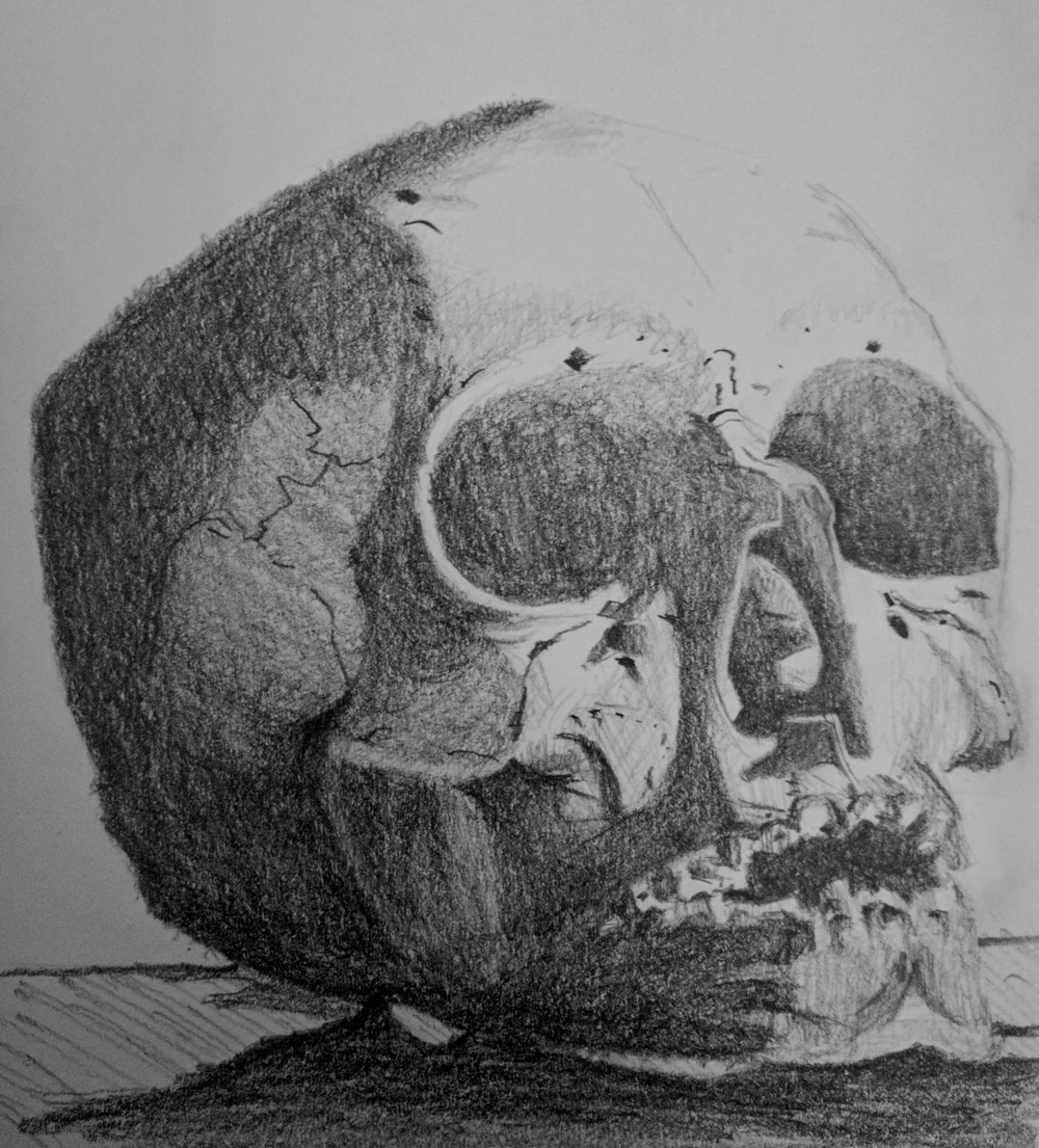
Graphite on paper of A skull.

Apparently skulls are very good subjects for practicing light and shadow, i.e. values. But they’re not as good for shapes and proportion. For example, if the proportion is off slightly in a portrait drawing, then the human brain can immediately tell that something’s off. On the other hand, if the orbit (eye socket) a skull is too large, then we don’t usually notice. Our brain is not very good at distinguishing between different skulls.
I haven’t found a style of shading that I like yet. Some artists use a lot of blending, others use distinctive lines and crosshatching.